



Family Crest Colour Meanings: A UK Guide to Tinctures and Their Symbolism
A practical UK guide to heraldic tinctures — metals, colours and furs — with traditional symbolism, British examples and advice on choosing a palette that works.
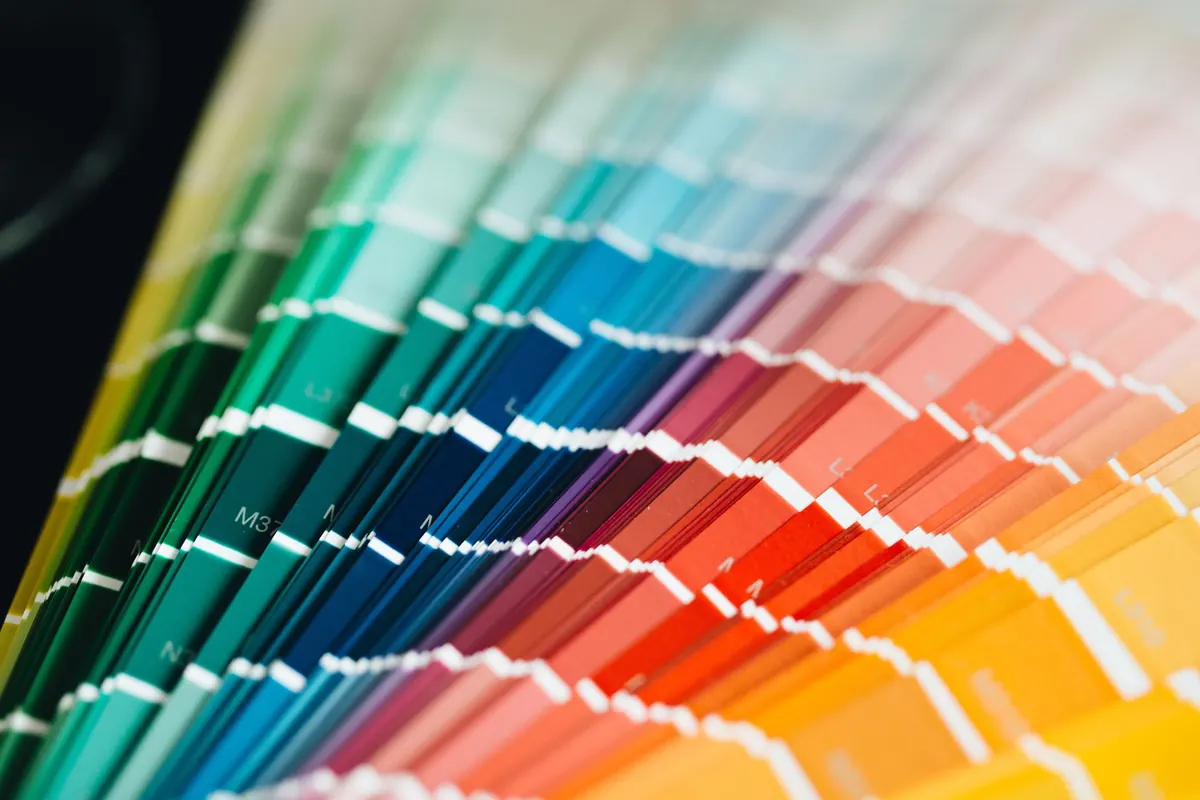
Most people who ask about family crest colours want to know two things: what did red mean on my ancestor's shield, and can I still use it? The first question has a long, slightly murky answer rooted in medieval and early modern heraldry. The second is often easier than people expect. Colour is the loudest part of any coat of arms and it does more work than the charges. A lion in gold on a red field reads at fifty paces; the same lion in murrey on sanguine vanishes. What follows covers the tinctures you will actually meet in British arms, what they have traditionally been said to mean, and how to pick a palette that still looks right on a signet ring, a bookplate or a carved oak panel.
The Tinctures: Metals, Colours and Furs
Heraldry sorts colour into three groups, and the vocabulary is worth knowing because it is what you will meet in any written description, or blazon, of a coat of arms.
- Or — gold; shown as yellow when real metal is not possible.
- Argent — silver; shown as white.
- Gules — red.
- Azure — blue.
- Vert — green.
- Sable — black.
- Purpure — purple.
- Ermine, vair and potent — furs, which are patterns rather than plain shades.
- Murrey, sanguine and tenne — the "stains": mulberry, blood red and orange. They appear in older books far more often than in British arms.
Two things trip people up. A crest, strictly speaking, is the device that sits on top of the helmet; the coloured shield is the coat of arms. And black is a colour in heraldry, not an absence of one, so Sable belongs alongside Gules and Azure rather than outside them.
What the Tinctures Traditionally Signify
No grant of arms comes with an explanation of its colours. The meanings most people quote come from seventeenth-century and later writers, and those writers do not always agree with each other. Read the list below as tradition rather than rule.
- Or (gold) — generosity, nobility of mind, glory; often linked to reward for service.
- Argent (silver) — peace, sincerity, innocence.
- Gules (red) — martial courage, magnanimity, sacrifice, noble blood. The most common colour in British arms by a wide margin.
- Azure (blue) — loyalty, truth, justice, constancy.
- Vert (green) — hope, joy, faithfulness, growth.
- Sable (black) — constancy, prudence and, in some readings, mourning. A dignified and serious choice.
- Purpure (purple) — sovereignty, justice, temperance; regal associations.
- Ermine — dignity and high office, carried over from the fur robes of peers and monarchs.
The practical consequence is simple. You should not claim your family was granted red for bravery. Colour meanings are a layer of interpretation applied after the fact; the evidence that matters is the blazon, the grant itself and any family record. If someone sells you a "meaning certificate" for your tinctures, treat it as decoration.
Reading Real British Shields
The quickest way to see how tinctures behave is to look at arms you already know. The Royal Arms of England are Gules, three lions passant guardant in pale Or: red field, three gold lions. Scotland's are Or, a lion rampant Gules, within a double tressure flory counterflory of the second: gold ground, red lion, red border. Ireland's are Azure, a harp Or, stringed Argent. Wales uses quarterly Or and Gules with four lions passant guardant counterchanged, meaning the colours swap between the quarters.
Family arms show the same restraint. Douglas is Argent, a heart Gules, on a chief Azure three mullets Argent — silver field, red heart, blue band across the top with three silver stars. Campbell is gyronny of eight Or and Sable, the field split into eight wedges of gold and black. Neville is Gules, a saltire Argent. Howard is Gules, a bend between six cross-crosslets fitchy Argent. Every one of those designs is carried by two tinctures.
That is the pattern worth copying. Arms people remember are almost always built from two or three tinctures arranged with strong contrast. Add a fourth and the shield starts to look like a jumble of coloured paper.
The Rule of Tincture
Heraldry has one compositional rule that explains most of what looks right and wrong on a shield: metal is never placed on metal, and colour is never placed on colour. A charge sits on a field of the opposite group. Gold on red, silver on blue, green on gold — those work. Gold on silver does not, and neither does blue on black.
There are accepted exceptions. Furs count as either group depending on what surrounds them. Charges described as proper, meaning shown in their natural colours, can sit on anything. Fields divided into metal and colour halves are fine in themselves. And the arms traditionally attributed to the Kingdom of Jerusalem, gold crosses on a silver field, are the famous case everyone cites as breaking the rule without suffering for it.
Furs and the Rarer Tinctures
Ermine is a white field with small black tails scattered across it; counter-ermine is the reverse. Vair is a blue and white pattern of interlocking bell shapes, borrowed from squirrel fur, and potent is a T-shaped variant of the same idea. In British heraldry a fur field carries a sense of age and formality, though it does not by itself confer rank.
The stains are a different matter. Murrey, sanguine and tenne occasionally turn up in Scottish and Irish arms, but unless you are reproducing a documented blazon that genuinely uses them, they add ambiguity without adding meaning. Most people mistake murrey for a faded Gules anyway.
Choosing Colours for a Modern Crest
If you are commissioning a crest, a signet, an embroidery or a family wall panel, work through this in order:
- Start with what exists. If arms are recorded for your family, copy the tinctures from the blazon exactly. Interpretation can follow; accuracy comes first.
- Decide the medium before the palette. Enamel and embroidery handle strong flat colour well. Print and screen handle subtlety better. Wood and stone reduce everything to two or three tones.
- Aim for two metals plus one colour, or two colours plus one metal. That gives contrast with variety and keeps the shield legible.
- Test at thumbnail size. Shrink the design to 20mm. If the charges blur into the field, the tinctures are too close in value — Sable and Purpure are the usual culprits.
- Keep one colour dominant. If red and blue each cover a third of the shield, neither registers as the ground.
- Check the pairing, not just the hue. Azure
Photo: Peter Olexa / Pexels